Tuesday, March 22, 2005

"Creating a Color Palette"


Color Harmony is all around you.

Nature by design enraptures you in its color harmony...


"Orange Flower" Color Scheme

I took this picture while walking up the mountain. I was captivated by the vivid yellows and oranges, which contrasted beautifully with the greens and the sparse naturals and browns.

The process
After I imported the photo into Adobe Illustrator 10.0, I was able to use ColorPic to color-grab colors from the photo and create the four-color palette. It was quicker than using the eye-dropper in Adobe Illustrator. There are considerably more colors within the photo but I limited my choice. The graphic art was then done with Adobe Illustrator 10.0. Simple, yet effective. I'll be posting more of these kinds of color palettes in the future.

Tell me what you think?

Sunday, March 06, 2005

"Free Online Book: - 'Color, Contrast, and Dimension in News Design' "

"Colours, like features, follow the changes of the emotions." - Pablo Picasso (1881-1973), Spanish Artist


"Color, Contrast, and Dimension in News Design", is a great online resource. It's an interactive color experience combined with useful information and awesome examples and exercises.

Highly
Recommended


So how did this book come about?


In 1992, Pegie Stark Adam, worked with The Poynter Institute to develop, Color, Contrast, and Dimension in News Design. This book was used to create an online version, "Color, Contrast, and Dimension in News Design".

You can use the online version as an interactive teaching tool as it explains color theory and shows you how to use it in design through examples and exercises. These exercises are an awesome, hands-on experiences, that are vivid examples of the physiology of color. You, the reader, is able to change colors of various media examples, so that you can discover for yourself how color can change, meaning, mood, and navigation on a page.
This is one of the sites you'll visit many times over.

Sections in the book include:-
  • The Power of Color
  • The Physiology and Theory of Color
  • Color, Contrast and Dimension
  • Color on the Web
  • Eye-Trac Research
  • Bibliography
"Color, Contrast, and Dimension in News Design" also describes the seven color contrasts identified by Johannes Itten (1888-1967), in his books, The Elements of Color and The Art of Color . Itten was a Swiss painter, designer teacher, writer and theorist associated with the Bauhaus school. He developed the so-called preliminary course which taught students the basics of material characteristics, composition, and color.

The seven color contrasts Itten identified are: -
  • Hue
  • Light and Dark
  • Cool and Warm
  • Complementary
  • Simultaneous Contrast
  • Saturation
  • Proportion
The color contrasts are illustrated with great examples in "Color, Contrast, and Dimension in News Design" .
This is a useful reference.

You can learn from a Master of Color.

Johannes Itten has written awesome books about color that will help anyone master color. You can buy his books at Amazon.com.


Wednesday, March 02, 2005

"Choosing Your Colors - Color Inspiration from Photos"

"A colorist makes his presence known even in a simple charcoal drawing."- Henri Matisse (1869-1954), French painter, sculptor, & lithographer
The awesome thing about color is that it's free online, so you can choose to your heart's content. Great! But sometimes color inspiration is needed. So you might asked, "Where do I get color inspiration?".
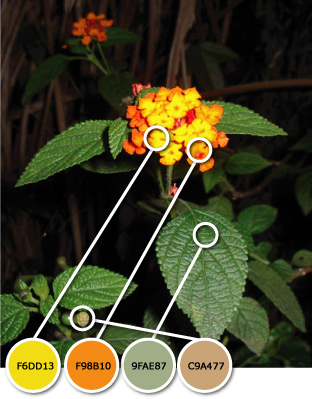
Color Inspiration from Photos

Photos are a great source of color inspiration. If you have a picture with great colors then use a color picker like ColorPic to choose your colors. Then make your own color palette, but limit your colors. Choose two to four colors. Generally duotone (2 colors) and monotone (1 color) websites have strong intensity.

I used this awesome photo of Table Mountain (Cape Town, South Africa) to pick some colors using ColorPic. I love the colors in this photo. There are many shades of blue, purple and pink. I love the cool mood with a tinge of warmth that this photo evokes.


There are many colors to choose from, but I limited my choice and created a ten color palette, as a starting point.


Then I chose four colors that had good color harmony. Remember, duotone (2 colors) and monotone (1 color) websites generally have strong intensity. Now I have a great color scheme to colorise a website.


There are so many color schemes that you can generate from photos. Your possibilities are endless.

Read this great article by Suzanne Stephens, "Web Page Color Scheming - Using Your Photos", that really shows you the potential of color scheming using photos. You can take a sneak peak at the finished website she created using using photos for the color scheming at Endless Rivers. Amazing color combinations that really capture the mood of the website.

So color scheming can be fun and easy. So use your photos for some color inspiration. Your options are limitless. Your imagination is your only limitation. Be a kid and play and create.